THE HAGUE, 1 June — It’s already 1 June here in The Hague, but still 31 May in North America where many Newbie Blogger Initiative peeps are located. As everyone is wrapping up this wonderful month of new blogs and great advice, I wanted to troll thru the list of new blogs and pick a few to talk about.
After wading thru the hundred-and-I-don’t-know-how-many blogs I finally decided to talk about some of the blogs I thought looked great. In a way that’s unfair since I’d expect a blog to start with some words, maybe add a few pix, and get around to overall design, interface, and usability a little down the road. Well, it may be an “unfairly” high bar, but a lot of peeps sailed past it anyway. I limited this post to 16 that I liked just so it doesn’t go on forever, but there are many more that were worthy.
• My Posts for NBI
• NBI Newbie Blogger Check-in Page
• The Oh-So-Valuable MORE Tag!
I apologize, and definitely LMK if you find any errors or omissions here. It was a lot to poke thru, and there could be name typos, bad URLs, etc. Also, I should have looked at all the new blogs off of one of the cool lists that many peeps made. But I actually tried to click thru all 16 pages of posts in the NBI Newbie Blogger Checkin Forum, so, silly me, I may have not read a post carefully and have some veteran blogger here on the “cool newbie” page – sorry if that happened! 😛
haha, that and I nearly crashed opening so many blogs!
NoteToSelf: You don’t have to have all the blogs open in tabs at the same time! 😛
Thanks to all the oldbies, newbies, organizers and everyone who helped make this such a nice month. And… here’s 16 blogs I thought looked pretty cool:
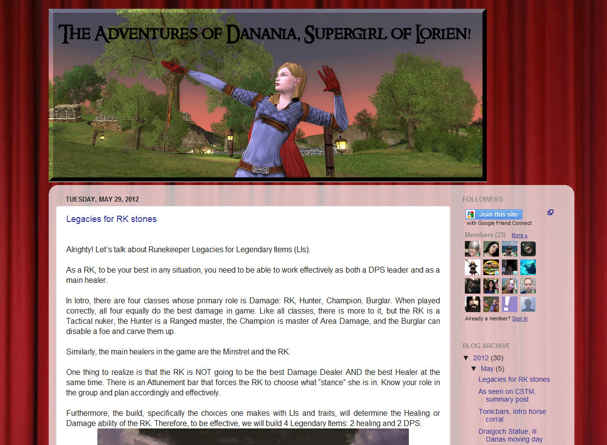
1. The Adventures of Danania, Supergirl of Lorien!
2. Bloodthorne
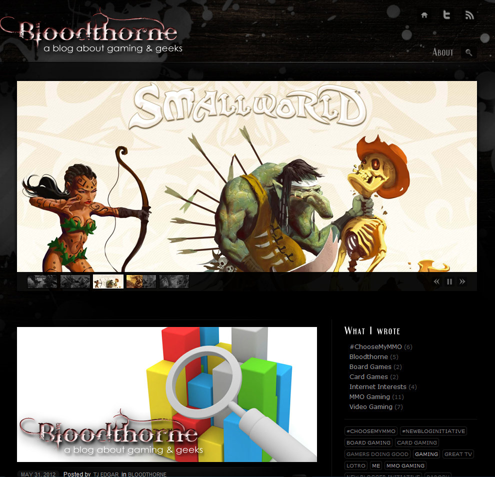
Bloodthorne however is a real exception, this gorgeous blog really makes the black background work. The image slider atop the home page gives us a range of visuals that can hook us in many different ways depending on individual interest.
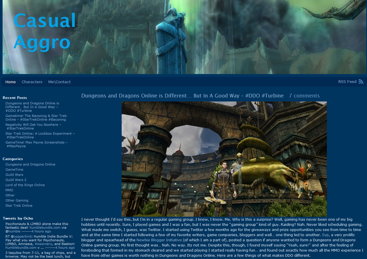
3. Casual Aggro
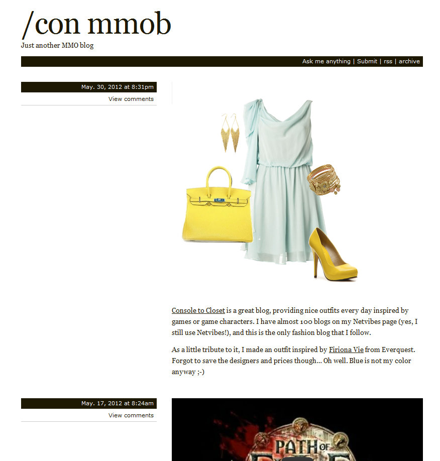
4. /con mmob
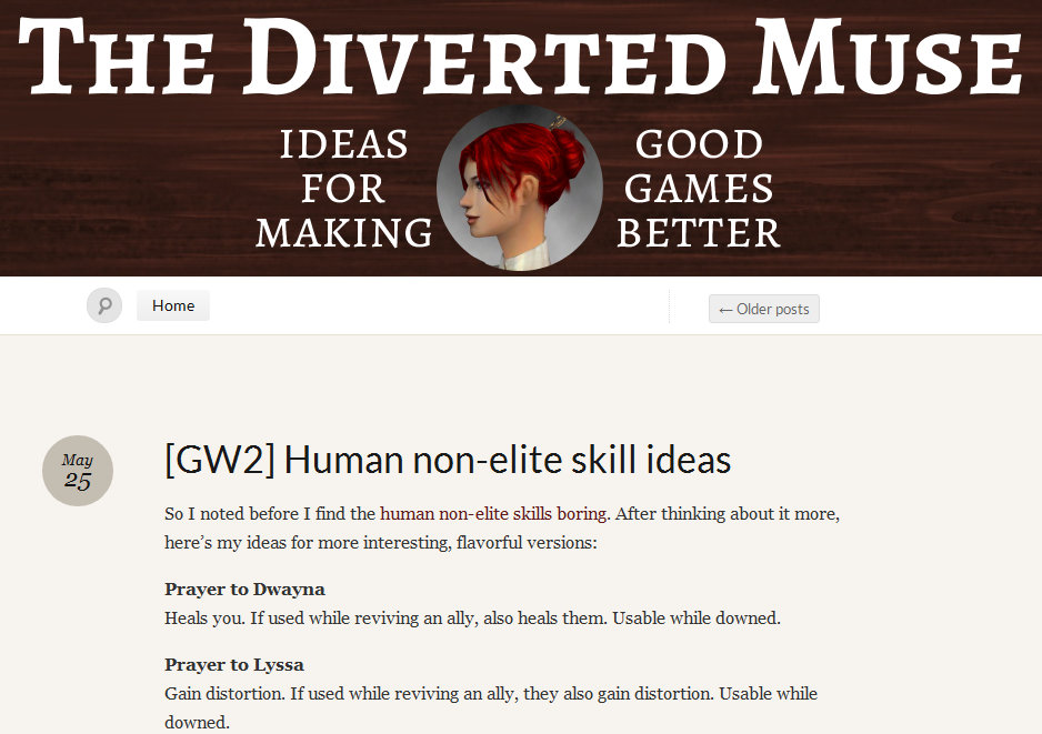
5. The Diverted Muse
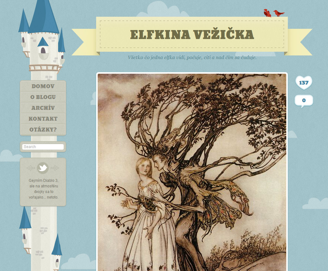
6. Elfkina Vežička
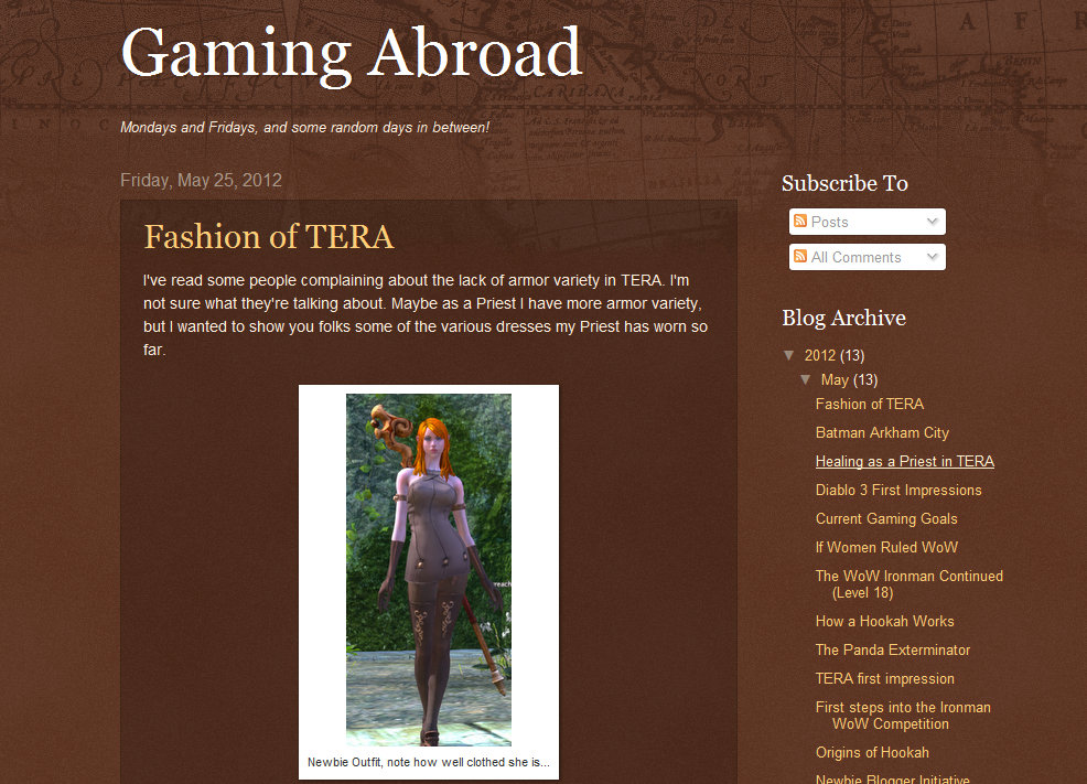
7. Gaming Abroad
8. Giddeon’s Hammer
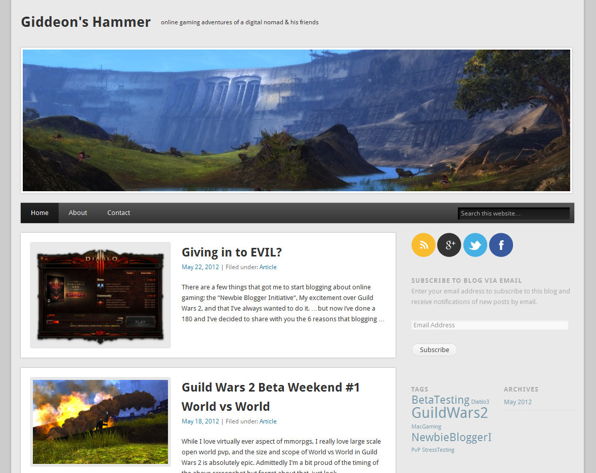
Giddeon’s Hammer uses an elegant, beautiful home page with excerpts and “Read More” links to give me the maximum number of article choices, and therefore to give itself the maximum number of chances to connect to readers.
9. GnomeGates.com

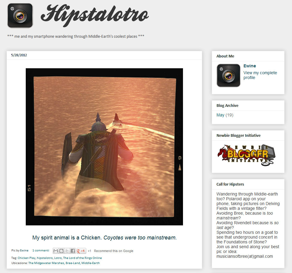
10. Hipstalotro
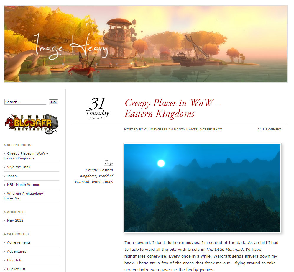
11. Image Heavy
12. Landroval Style
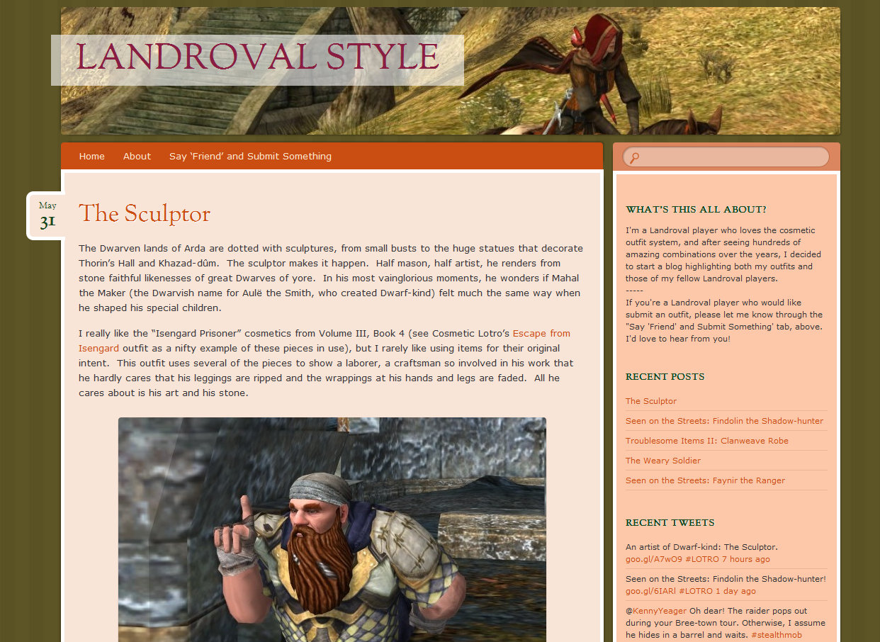
You know already know my rabid preference for EXCERPTS over Full Posts, so my one like-anybody-asked-me suggestion for LRS is to go to Excerpts. It would look extra nice on this blog since each post has the cool “Date Tab” as you see with “May 31” so if the blog goes to excerpts and perhaps long skinny “Featured Images,” then that home page will sizzle with post tabs and options for blog reading.
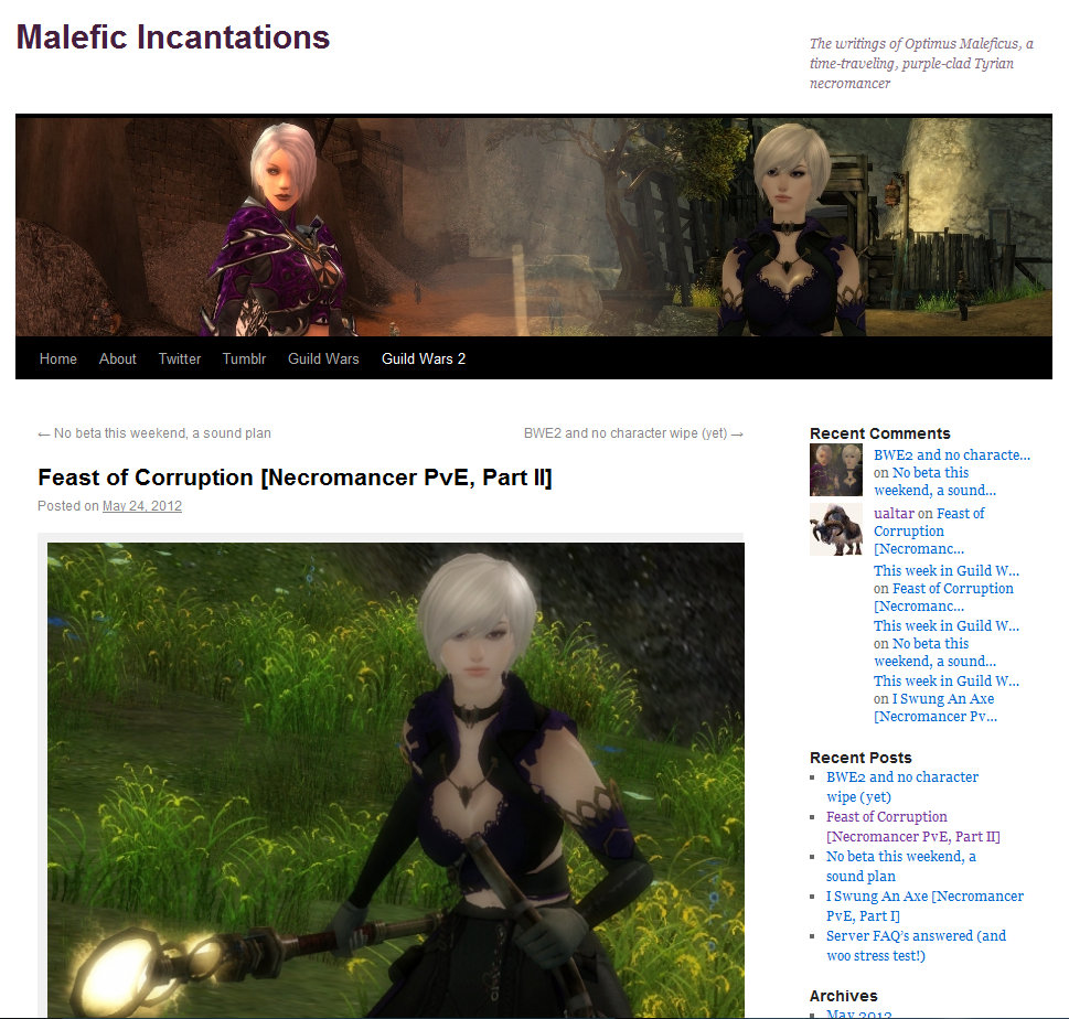
13. Malefic Incantations
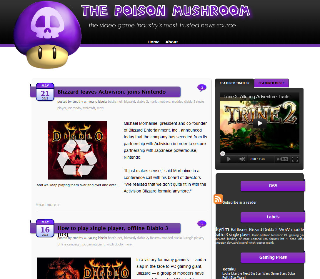
14. The Poison Mushroom
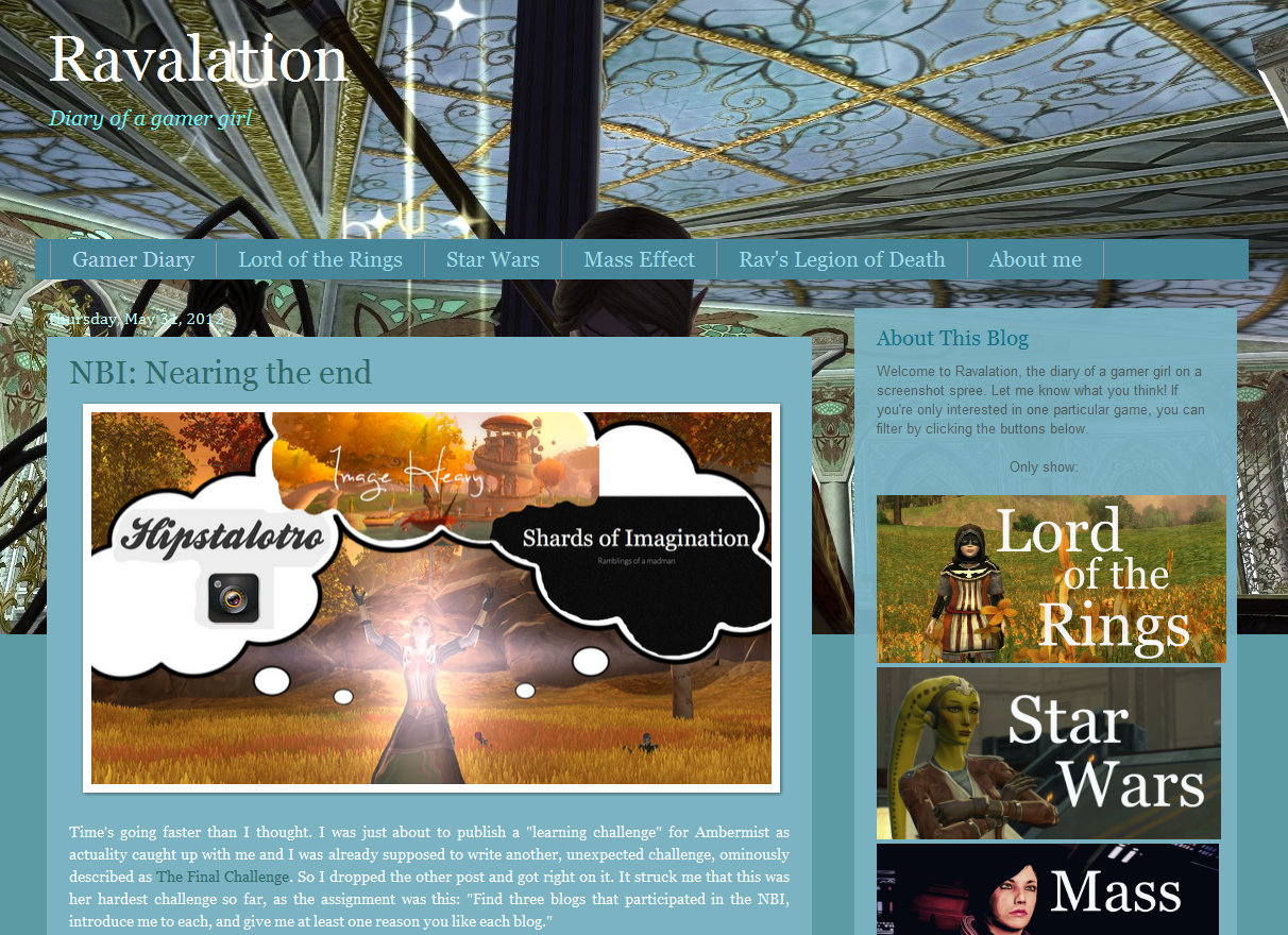
15. Ravalation
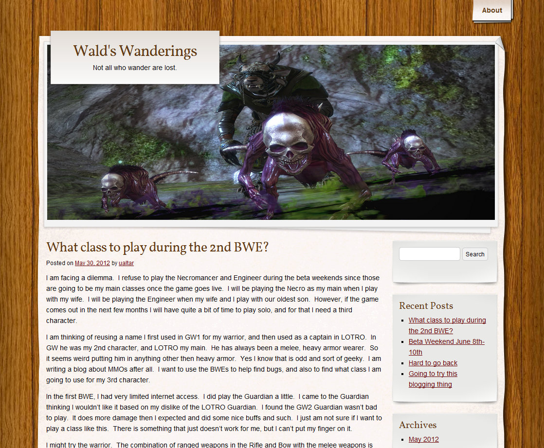
16. Waldl’s Wanderings
Well, there’s 16 that I really loved. There were many more. Got a favorite? Go on! Throw a link in the comments below! 🙂

This is a great overview of NBI blogs. Somehow, seeing their covers all together likes this makes them look all awesome. It’s like scrolling through magazines-within-magazines (sorry id I’m not making much sense now)!
I was also pretty shocked to see my blog entered among these gorgeous looking blogs. There’s so much I want to change still! I’m feeling humbled to see myself posted. Thank you!
hahaha, no worries Ravanel, you’re making plenty of sense!
Yes I agree about the magazine (of magazines) I did it that way, of course, since I was talking about Design / Aesthetics / UIUX, but I too find it kind of exciting. It’s actually true that I opened so many tabs looking thru them all that my browser got kind of slow, and it’s nice to see them all fast and easy like this.
Oh, ha, in the spirit of NBI, here’s one more piece of advice! I think it doesn’t apply to anyone I’ve seen, but I’ll throw it out FYI anyway:
I’ve already talked about my love of the more tag for aesthetic / technical / functional reasons:
http://irez.uk/2012/04/21/the-more-tag/
Another thing about this approach is that you’ll never see a YouTube video on my home page. They way slow down loading. So I’d prefer to have a home page of words & still images that loads as fast as it can… and then if you choose to view something specific, you’ll probably have a few more seconds of patience as your specific choice loads.
Oh, and I don’t have any real numbers on this, but it *feels* to me like this is mostly only true on pages with MANY videos. I think ONE video doesn’t really slow the page down too much, but several kinda do.
Anyway, back to the point Ravanel, YES! your blog looks really great. I love the big buttons if I’m only interested in a specific world and the big masthead image is fantastic.
Oh, one tiny point you might look at. This probably doesn’t come up too often, but I have a larger monitor and I run full screen, so at least 1 person sees this… your whole home page seems to be centered… except that masthead image is aligned LEFT… so on a smaller window everything lines up… but if you do have a big window (hahaha, IDK if you know, but before phones and iPads peeps used to use these things called laptops and even before that, like, your grandparents had “desktops” and some of them had big monitors (actually, of course, gamers are more likely than most peeps to have desktops and big monitors)
… right.. on a big monitor, the top / masthead image is off to the left and the whole rest of the home page is offset from it, in the center.
Drop by and shout if there’s ever anything I can help with or give my humble-or-otherwise opinion on. Congratulations on launching such a beautiful blog!
keep up the lovely work! 🙂
Oh damn, I really should do something about that, that must look horrible! The only downside is that I really suck at coding. It was already so much work to get it working as it does. I hope there is some sort of code that makes the content end up to the left by default, I think that would sort out most of the problems. You’ll of course have a turquoisish area to the right without anything on very large desktops, but I think that would be survivable. I’ll ask my geek friends if they can find anything. Thanks for mentioning this!
On the advice topic you linked:
I chose for the full article option myself, because I’m actually quite the opposite of you, hehe. I feel a bit of panic when seeing so many small article parts on a front page and don’t feel the urge to continue clicking at all. I do see the advantage of having a good overview of recent articles, though, and it’s always good to know how-to just in case. I’m thinking of a sort of “hybrid version” for my own blog: the full posts, but a place with my latest five posts in the sidebar (plus their first sentences etc) somewhere on top. That way the structure might be clearer. What do you think? I know you don’t like full article blog that much, but I guess we’re all different. 🙂
I luckily don’t usually post any movies, but I did notice my blog became pretty long to load for myself, perhaps because it has so many images. Do you have this as well? I’m sort of wondering if this causes problems or if it’s only me (my pc is getting old).
Thanks for the extensive response!
Thanks Ravanel!
Yes, I have become an ever bigger “Excerpt” believer. But the main thing for me is that you’ve made a choice. The fact that your choice is the opposite of the one I might make, *sniffle* really doesn’t matter at all! 🙂
Seriously, it actually doesn’t. I’m just sad at how many choices are left to default. Be it the home page of your blog, or the license on your Flickr pix, etc. Your blog, your pix, it SHOULD be your way. I just hate seeing, for example Flickr pix locked up under Copyright All Rights Reserved only because the user doesn’t know what the choices are or how to use them. If they “really” choose C-ARR, I’m fine with that. So of course I’m fine with your choice on your blog! 🙂
And, yes, I do like your “compromise” idea… to have a full post on the home page, and then a sidebar “menu” of the last 5 posts – that’s pretty good.
The home page UI/UX “Feels” so important to me… but it actually probably only matters to a small percentage of peeps.
Your “regular” readers pretty much look at everything you post, so they’re going to see it all anyway.
Anyone who gets to your work from a Google search will probably go straight to a specific post, so they’ll likely never even see your home page.
So it’s only those in-between the 2, who actually visit / land on your home page that will even “contemplate” the UI/UX that you and I have noodled and thought so long over.
Although pretty much every week, my home page is either the #1 or #2 page of the week, so a decent number do land there.
Hope you sort out that image alignment thing! I’m not a coder either and I sort of hate that. Like I’m part of some technological underclass. Then again, I do remember a long time ago I was having my bike worked on at some bike shop, and the guy said “You can either work on bicycles, or you can ride bicycles, but you can’t do both.”
Maybe that’s true for web content too. If we were developers with those skills — hahaha, well besides making more money! 😛 — maybe we’d wind up doing way more coding and less content posting. IDK. Anyway, I feel a little lame for not “rolling my own” but I’m happy there are such cool themes / templates for pouring content into.
BOTTOM LINE:
Your blog is awesome! Thanks so much for doing it and for sharing your ideas Ravanel!
Oops, I totally forgot to reply to your question about image loading times.
On a platform like Wikispaces, I think they load the whole image on the page, so if you had 10 huge megapixels images on a page, that would load REALLY slow.
On WordPress I think they load a scaled down version of the image. So even if you posted full size camera images, I think it’d only load screen rez till you clicked for full image, so a page of images should actually load pretty fast.
On Blogger, IDK… but I’d guess it’s like WordPress rather than Wikispaces, so probably, your page of images isn’t really hurting a lot.
I do try to have all the images on my own blog. The WordPress.com servers might or might not be fast, I actually think they’re kind of medium, but at least if the content is all from 1 site, you’re only counting on 1 set of servers more or less.
If you embed / link to, pix from many different sites, then just to draw your 1 page you’re depending on content/servers from all over the globe, any of which could be down or slow.