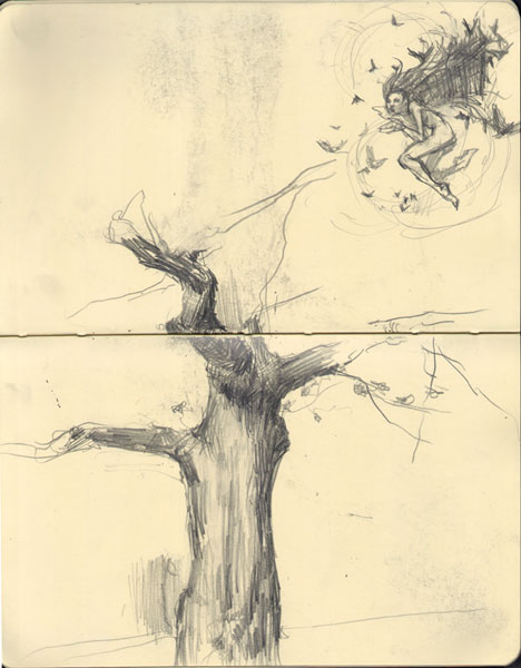
WAN CHAI, HONG KONG, 1990 — Senior Year. Hong Kong Academy for Performing Arts. Artist’s Sketchbook. haha. My early vision for thesis concert. I didn’t fully appreciate how unlikely a BFA concert was to get either a flying rig or a giant tree setpiece. But it was a lot of fun to scribble and imagine. And to work out choreographic possibilities. And to feel the strength and confidence of a 21-year-old body.
THE HAGUE, 2012 — 22 years ago today. Holy crap. Can you believe that? It was the beginning of senior year at HKAPA and I was doodling ideas about our thesis concert. Of course it was grandiose stuff I could never actually do in an undergrad concert. 22 years ago. Half my lifetime ago.
Sometimes when I look at Ancient Art, or even just Renaissance Art, my mind reels at the inconceivably vast chasm of time between my living body now, and those past artists. It strikes me as a sort of dream time. A sort of fantasy. At 43 I can’t truly imagine, can’t fully appreciate, or grasp, such a cavernous distance of time. What drawing did Durer make 500 years ago today? There isn’t really such a thing as FIVE HUNDRED YEARS AGO TODAY, is there? My mind reels at such a possibility. It is a fiction! IT MUST BE A FICTION!
Did some distant human ancestor really paint on a cave wall somewhere in Southern France 15,000 years ago today? No! No! Such a thing is impossible. Or yes, of course possible in some “scientific” way, but so alien to my 43 years of breathing on this planet that it might as well be fiction. I can barely believe that I made this sketch 22 years ago today. 500 years ago today for Durer? 15,000 for the artists of The Dordogne? I guess it’s true if you want to believe it. It’s too, too long ago for a choreographer of very little brain to truly imagine.

I miss the Like button sooo much. I guess this star thing is my new Like? Love hearing about your varied life and The Hague in the Fall. Hugs, Yordie
Yordie, look mo betta! NOW you get TWO likes! The “Star” on Disqus… AND… up at the top of the post a “Like” thingy… and that one even puts a little pix at the bottom of the post. — that “Like Button” could be a the bottom too (if you want) but it made a new row right next to the Facebook / Twitter buttons and I thought TWO rows was a lot of clutter… but maybe it’s easier to find…
I found it! And am gearing up my button pusher.
hahaha – yay! I think the little icons with names are really nice.
What do you think about the button up top there — is it hard to find?
I can put it down where it was so you can see it… I thought it was kinda cluttered looking that way… but maybe the better ease of use should win…
I’m good with the little button at the top if that’s where it wants to be. I wish it was a little bigger. I’m a habitual Like button user. I think most people are going to look for the Like button at the bottom, just because so many blogs have them down there. I don’t think casual readers are going to notice it at the top. Just one woman’s opinion.
Okies, the Like button is now Bigger, At Bottom, and Darker too. See whatchoo think! 😀
Definitely agree it should be at bottom… hard to know if you like something before you’ve finished reading it sometimes 🙂
Absolutely! It’s our little way of saying, hey there, cool, yo!