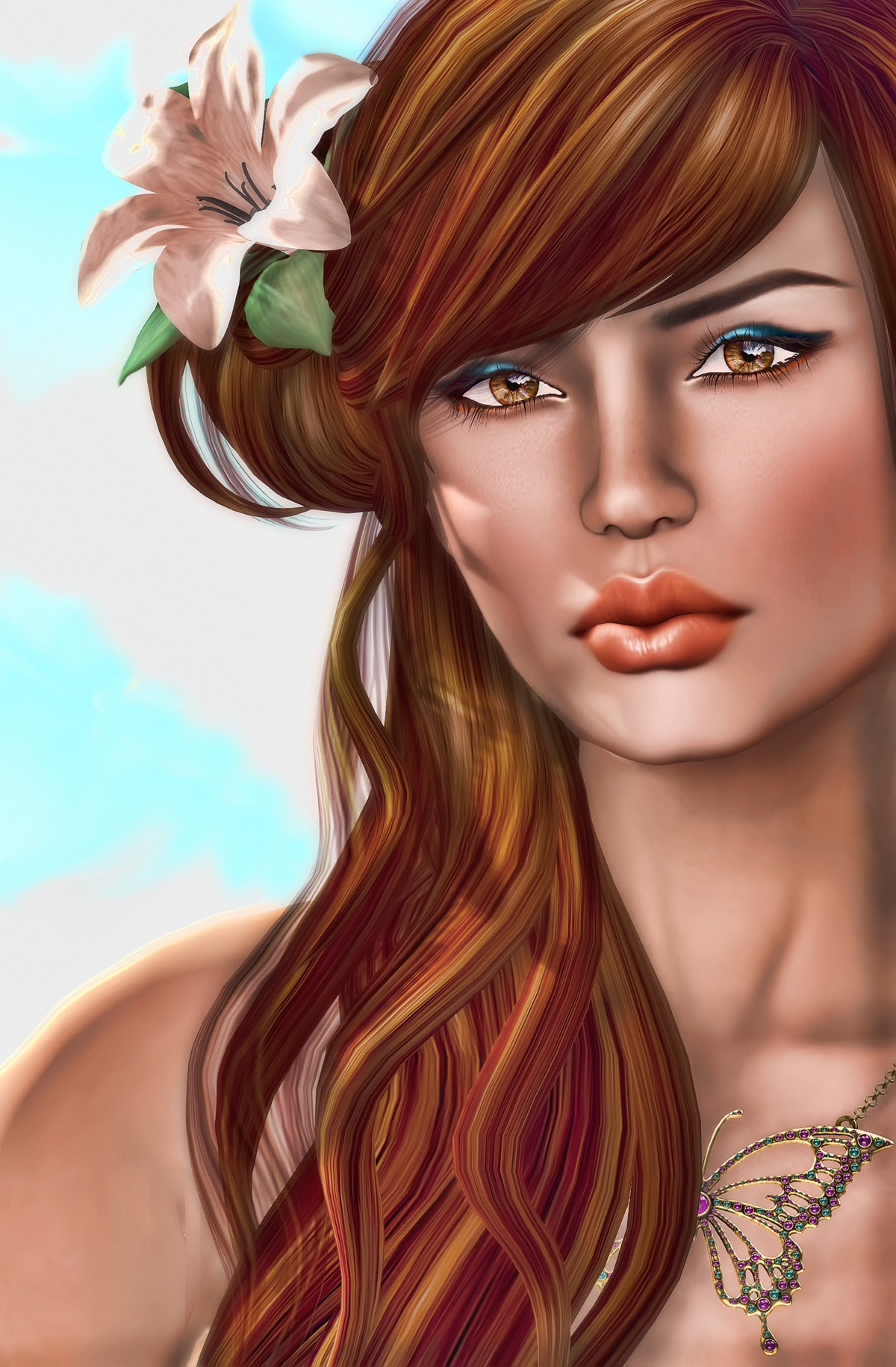
In the photo: Strawberry Singh
Location: Second Life
I was playing around with this photo in Photoshop and then I dragged it into one of my favorite editing sites, PicMonkey.com and played with it a lot over there as well. They have so many options and buttons to play with, I can spend hours on that site. I ended up really liking the result. Although most of the time I prefer my photos to be a bit more realistic and de-saturated, I like the painted, colorful look this one has. It kind of has a tropical feel to it and reminds me that I only have a few more days of vacation left till school starts again.
Let me know how you like PicMonkey.com if you give it a try!

I’ve been using PicMonkey for all the shots I post for the last couple of weeks and I love it! In spite of it being so easy to use, I’ve only scratched the surface of what it can do! Thanks for passing on the info in the first place as you’re the first person I heard about it from. And by the way, that’s a gorgeous picture!
I used to use picnik and when it closed, picmonkey was one of the sites it referred users to. I’ve been very happy with it so far. I love the shot – can you tell me where your necklace is from?
Hey galacaproni! I was admiring Berry’s necklace also! 🙂
And thanks for stopping by iRez!
I too am a big fan of desaturating VR images. I do think they are, on average, oversaturated in a not-so-pleasing, not-so-realistic sort of way.
To say that one VR image is more “real” than another is a pretty goofy and slippery can-of-worms. Here’s a crazy thought, when you look at “real” pictures in any magazine, they’re probably more heavily Photoshopped than your average VR image! 😛
Anyway, everything is slippery and everything is in the eye of the beholder. But perhaps because we look at so many images and so many images of faces, we do have both preferences, and a detailed, nuanced lexicon of image “signifiers” or “codes” for specific meanings or associations.
Once I start desaturating an image, I often find that B&W or a sepia or selenium ish toned image is the most pleasing for me. In a way it’s less “real” since life is in color for most of us. But I guess I find chroma a distraction and often love to revel in the TONALITY that is so central to so much great photography.
I don’t think VR today has the gamma of Weston or Adams, but it can be pretty exciting in B&W.
haha, hAVINGsAIDaLLtHAT… I too love this image a lot. And when I’m not desaturating an image I sometimes like to hypersaturate them.
It feels very pastel-like for me. That’s funny in that we normally associate pastel with a certain texture of the substrate, and this is so smooth, but I also think of pastel as the purest experience of color possible, that there’s no oil or acrylic or egg to mess with, that a stick of pastel is a jar of pure pigment that you can almost stick your finger in and write out with pure chromatic experience. That’s kind of what this image feels like to me.
Geez Berry… your photography and editing are so enjoyable. I must, must I say, start playing around with PicMonkey. Love it.
You do know PicMonkey was at VB41 – Rock the Casbah, right? Unfortunately you went “Psycho Mode” and sunk his boat. You DID hear all that frantic screaming as his boat sunk, didn’t you?
Anyway, the monkey sez “Yordie San: Persona Non Grata! – eek eek eek, arrrhhh arrrhhhh”
@ Becky, thank you! I can spend hours and hours on picnik and not even realize it.
@ galacaproni Thank you! The necklace is from Maxi Gossmar and it’s available at Collabor88 right now. I have full credits with slurls in my blog post here: http://strawberrysingh.com/2012/08/14/butterfly-fly-away
@ Vaneeesa it’s funny you mention it, when I was processing I too was thinking of making it more like pastel or oil painting type art. I was thinking of texturing it that way, but wasn’t sure I’d achieve a good result with that so left it. I’m glad you like it!
@ Yordie, thank you! You are always so encouraging. <3 I hope you like PicMonkey, it can be a lot of fun!